

Creating a peaceful and relaxing atmosphere in your home often begins with the colors you choose for your walls, furniture, and décor. Calm colors have the power to soothe your mind, reduce stress, and promote a sense of well-being. Whether you’re redecorating a single room or your entire home, selecting the right calm colors can make a big difference in how your space feels. This guide will help you understand which colors create calming environments and offer practical tips to choose the perfect hues for your home.
Why Choose Calm Colors?
Calm colors help create an environment where you can unwind after a busy day. Unlike bright or bold shades, calm tones tend to be soft and muted, promoting relaxation and comfort. These colors are perfect for bedrooms, living rooms, and any area where you want to encourage peace and quiet.
Using calm colors isn’t just about aesthetics — it’s also about how colors influence mood. Gentle shades can lower anxiety, improve focus, and enhance sleep quality, contributing to a healthier home atmosphere.
Popular Calm Colors and Their Effects
Before diving into tips for choosing calm colors, it helps to know some common hues that bring tranquility:
– Soft Blues: Blue is associated with calmness and serenity. Soft blue shades can mimic the sky or ocean, helping you feel peaceful and clear-minded.
– Muted Greens: Green reminds us of nature and growth. Muted greens can reduce stress and create a fresh, balanced vibe in any room.
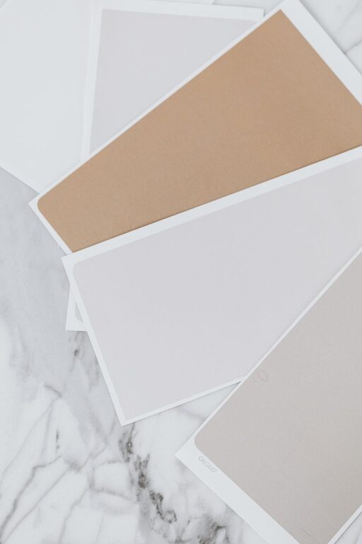
– Warm Neutrals: Colors like beige, taupe, and warm grays are grounding and inviting without overwhelming the senses.
– Lavender and Soft Purples: Light purples can be calming and add a touch of elegance and softness.
– Pale Pinks and Peaches: These gentle tones are warm and comforting without being too bold.
Tips for Choosing Calm Colors for Your Home
1. Consider the Room’s Purpose
Think about what you want to feel in each room. Bedrooms benefit from soft blues, greens, or lavender to help you wind down, while living rooms might work well with warm neutrals or muted greens to create a cozy yet peaceful space. Bathrooms can be refreshed with pale blues or soft grays for a spa-like vibe.
2. Test Colors in Different Lighting
Colors can look very different depending on the lighting. Natural sunlight can brighten tones, while artificial lighting might add warmth or coolness. Test paint samples on your walls and observe them at different times of day to ensure the color maintains a calm feel.
3. Use a Monochromatic Color Scheme
Using different shades and tints of the same color helps maintain harmony. For example, combining light blue walls with deeper blue accessories gives your space depth without overwhelming the senses. This approach creates a unified, calm look.
4. Pair Calm Colors with Natural Elements
Incorporate natural materials like wood, stone, or plants to enhance the soothing effect of calm colors. These elements add texture and life, making your space feel grounded and inviting.
5. Limit Bold Accents
While calm colors dominate, small accents in bolder but still soft tones can add interest. For instance, a soft green room might include cushions in muted coral or dusty pink. Avoid too many bright or contrasting colors that can disrupt the tranquil atmosphere.
6. Consider Paint Finishes
The finish of your paint can affect the mood. Matte or eggshell finishes work best for calm color palettes since they reflect less light and create a soft, understated look. Glossy finishes might feel too energetic or busy for peaceful spaces.
7. Use Color Psychology as a Guide
While personal preference matters most, understanding the general emotional effects of colors can help. For example, blue lowers blood pressure and heart rate, making it ideal for relaxation, while yellow may increase energy levels, so it’s better used sparingly in calm rooms.
8. Balance Warm and Cool Tones
Too many cool tones (like blue and gray) may feel chilly if not balanced with warmer neutrals or soft textures. Conversely, too many warm tones might feel busy or intense. Try to find a balance that feels comfortable to you.
Practical Ideas for Calm Color Usage in Your Home
– Paint the walls in a soft pastel green and add white or cream furniture for a classic, calming living room.
– Use pale lavender on bedroom walls paired with soft gray bedding for a restful retreat.
– Create a spa-like bathroom with soft blue tiles and natural wood accents.
– Add muted peach or blush throw pillows to a neutral-toned sofa to keep things peaceful but inviting.
– Incorporate indoor plants to complement green hues and introduce natural tranquility.
Final Thoughts
Choosing calm colors for your home involves more than picking your favorite shade. It’s about creating an environment where you feel safe, relaxed, and recharged. Keep your room’s function, lighting, and personal taste in mind as you select colors. Don’t be afraid to test samples and combine tones in simple ways that bring harmony.
With these tips, you’re ready to transform your space into a calming haven with beautiful, peaceful color choices. Enjoy the process of making your home a place where peace and comfort thrive.
—
Choosing calm colors is a wonderful way to enhance both the look and feel of your home. Use these tips to find shades that promote tranquility and create a comforting atmosphere for you and your loved ones.